When we talk about visual management in manufacturing, people often think about 5S or productivity management. In this post, however, I want to discuss the topic of visual management from the EHS perspective.
Safety visuals to implement
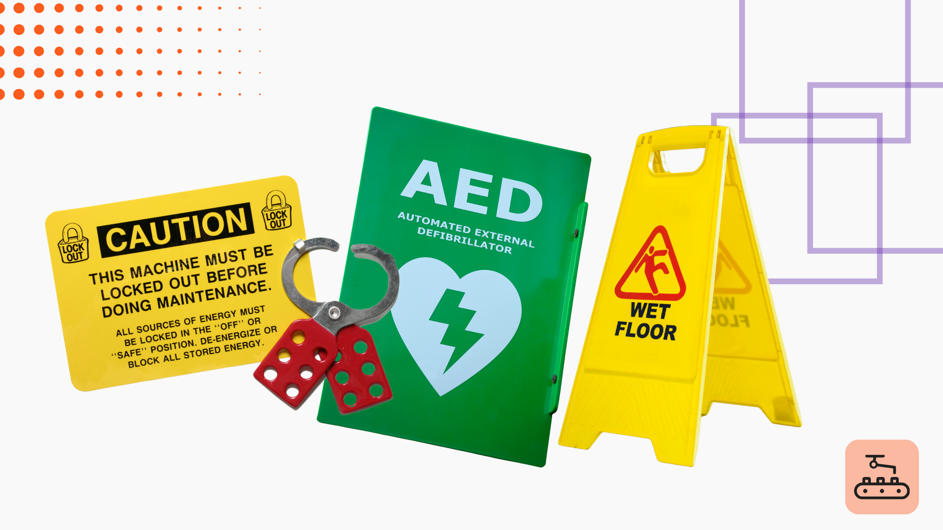
In most manufacturing facilities, visual cues help to reinforce safe behaviors. They also serve as critical reminders of the control measures you have in place.
When given in a clear and concise context, visuals can steer employees towards the safe actions you want them to take. This is something important I want to note:
Cluttered visuals can actually work against the intended goal.
You want to make sure that you focus on your core message and eliminate extra content when it’s not needed. Most people aren’t going to read a full poster of text. And if people are walking by or working near the signage, you don’t want them to be distracted by too much visual clutter.
Instead, consider how you can provide a reminder of a safety concern/protocol in the simplest way possible.
EHS information for visitors and new employees
When you first walk into any facility, you should know where you are and where you need to go. I’d recommend that each facility have a brochure-style handout to give to all visitors or new employees. This handout should cover:
- Site-specific EHS information (location of AED’s, first aid kits, etc.)
- Site safety rules
- Emergency response protocols
- Location of critical documents (contact info, SDSs, etc.)
For new employees, you should have visual cues letting them know where to check in and what they’re allowed to bring inside. Without this kind of notice, you might have individuals come onsite who are not properly dressed or who find themselves in restricted areas.
Having signs by the front door not only keeps the facility cleaner and safer, but it also improves the onboarding experience for new hires, which may influence retention rates.
OSHA signage requirements in manufacturing
Most manufacturing facilities must follow OSHA’s signage requirements which you can find in standard 1910.145(f)(3).
This standard points out that labels, tags, and signs should be:
“Used as a means to prevent accidental injury or illness to employees who are exposed to hazardous or potentially hazardous conditions, equipment or operations which are out of the ordinary, unexpected or not readily apparent.”
OSHA also says the signs must be posted as close as possible to the hazard and must be visible from at least 5’ away.
And since signs are almost always needed in facilities, you should make sure you get the right verbiage on them. OSHA 29 CFR 1910.145 specifies the use of verbiage on the signs, sign design and a few other key items you may want to look at.
Overall, I’d say that visual management in manufacturing facilities is a major component of EHS performance. I’d recommend that you perform a thorough audit of all the signage around your facility to find areas where you should add, remove, or modify visuals.

Jason Hathcoat
Jason is a seasoned EHS professional with more than 17 years of experience working in health and safety. He currently works as an EHS manager for a large global HVAC company.


